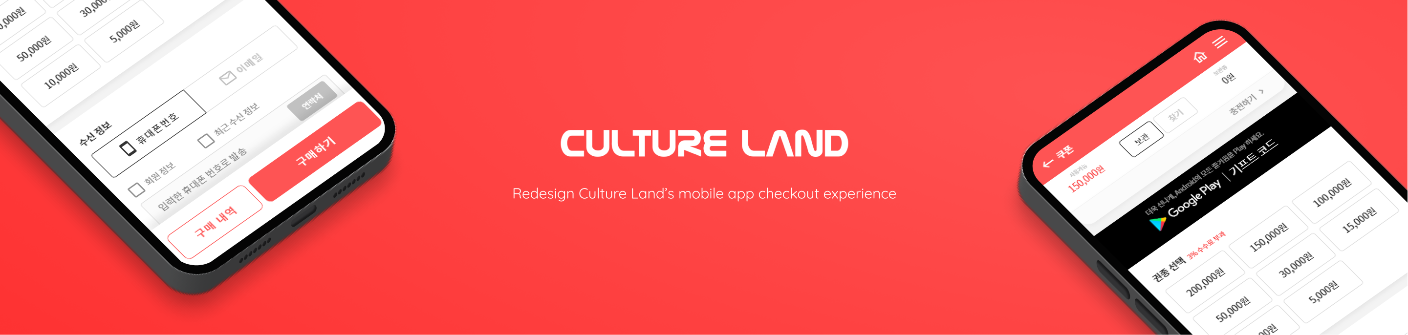
About Culture Land
Culture Land is an online platform that runs the Culture-Gift-Card service, a popular payment option in South Korea that is available for use on a wide range of online and offline services. These services are related to Korean culture like online games, shopping, books, movies, and so on. There are over 20 thousand stores in South Korea that have a partnership with Culture Land. Culture Land has roughly 9 million users and over 100,000 new users join Culture Land a month on average.
Overview
The goal of this project is to make a seamless checkout experience. 4 out of 6 main services contain checkout on Culture Land. I needed to figure out the problems with the current checkout process and offer solutions.
This project contains building a Culture Land Mobile App Design System. Because there is no design system, designers have to make new components, hard to reuse existing components. It makes work inefficient and offers inconsistent user experiences.
I led this project collaborating with a product manager and engineering team.
Timeline
Nov. 2020 - Jan. 2021 (3 months)
My role
Product designer
Responsibilities
- App analysis
- Paper and digital wireframing
- Low and high-fidelity prototyping
- Building design system
Platform
Mobile app
Team
Product manager (1), Engineer (2)
01. App Analysis
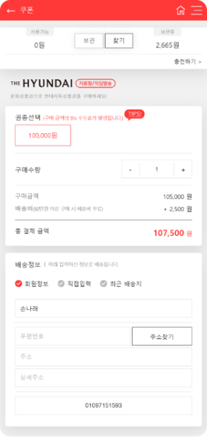
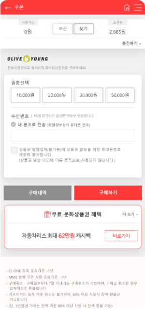
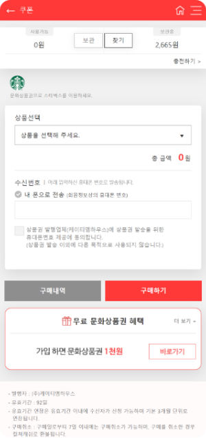
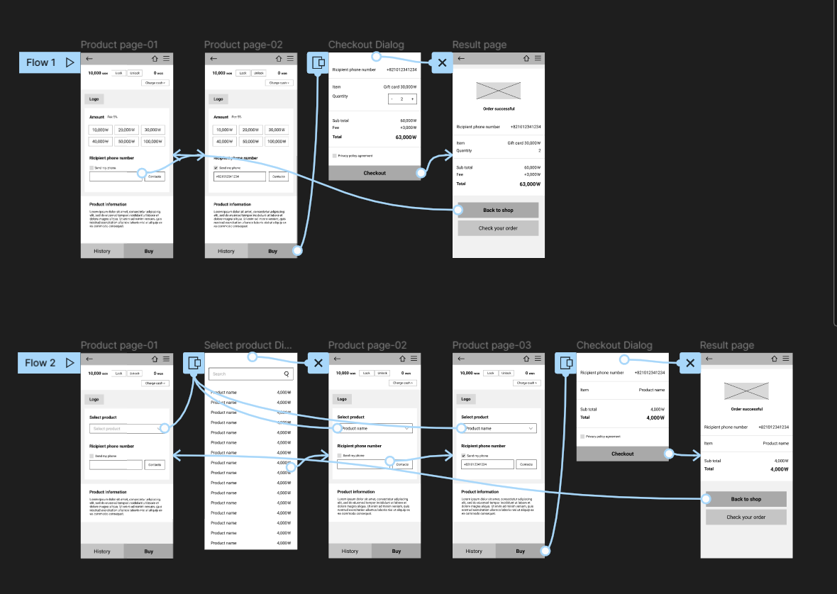
I categorized current products into 4 types to make templates for a consistent checkout experience. It's important to define types because each product has different checkout experiences. Some of the products have the same checkout process but have different screen designs.
After I define every product type, I created user flows in order to understand the current checkout process for each type.
Types
I defined 42 products into 4 types depending on the checkout process.
01
Physical gift card
02
Digital gift card
03
Digital voucher
04
Google play gift code
Current user flow
02. Define
Based on app analysis, I defined problem statements. Before I deep dive into ideation, I defined scope&constraints to set the right direction.
Problems
01. Inconsistency in user interface & experience
- The price is displayed in a different place for each type of page.
- Inconsistent pricing between the product page and checkout process.
- There are two different designs for the digital voucher page.
- Different words are in use for each type of page.
03. Cluttering Interfaces with too much information on one screen
02. Lack of search feature
There is no search feature, so users have to scroll down and find the product one by one.
Scope and Constraints
01. Engineering constraints
It was difficult to adjust the development team schedule, I had to minimize development changes.
02. Limited timeline
It was a tight schedule because, at the same time, I had to do other work as well.
03. Ideation
I brainstormed ideas for solutions that address the defined problems.
I distilled my findings into a few insights:
- Improve the checkout process and create a design guideline for a consistent checkout experience.
- Show detailed order summary for a more confident checkout experience.
- Offer a search feature.
- Increase the visibility of the key features and eliminate the ones less important.
New user flow
I restructured the user flow to improve the checkout process.
Wireframes
I created paper wireframes and low-fidelity prototypes to validate user flow.
04. Solutions
Pain point 01
Cluttering Interfaces with too much information on product screen
Solution
Increase the visibility of the key features and eliminate the ones less important.
Users had to choose too many choices on the product page, I wanted to split the page into two. But due to engineering constraints, it was impossible. So I moved or eliminated less important elements.
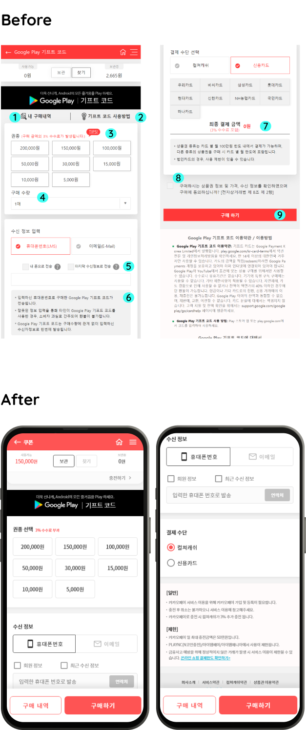
- Purchase history: I moved the ‘Purchase history’ button to the bottom for consistency. All of the other types of pages have the ‘Purchase history' button at the bottom.
- How to redeem: I moved ‘How to redeem’ to the order confirmation page because this information will be needed after purchase.
- I moved Tips for saving fees to the checkout dialog. This information will be helpful before the checkout.
- Select quantity: I moved ‘select quantity’ to the checkout dialog.
- I removed unnecessary tooltips. Tooltips have obvious and redundant information that is not beneficial to users.
- Information(recipient's phone number/e-mail) box: I moved the information box to the bottom of the page(product information) because it’s not that critical.
- I moved the total amount to the checkout dialog so that users check it before paying.
- Terms and conditions agreement checkbox: I moved the agreement checkbox to the checkout dialog.
- Buy: The 'Buy' button is placed at the bottom of the screen, in the same position, on the product page to provide a better-paying experience.
Pain point 02
Inconsistency of the total amount
- The price is displayed in a different place for each type of page.
- There is no detailed order summary.
- Inconsistent pricing between the product page and checkout process.
Solution
Make a clear and accurate order summary, including subtotal, fees, discounts, and shipping charges to provide a confident checkout experience
I removed the total amount on the product screen and displayed it on the checkout dialog. It's easier to find and check the total amount before paying.
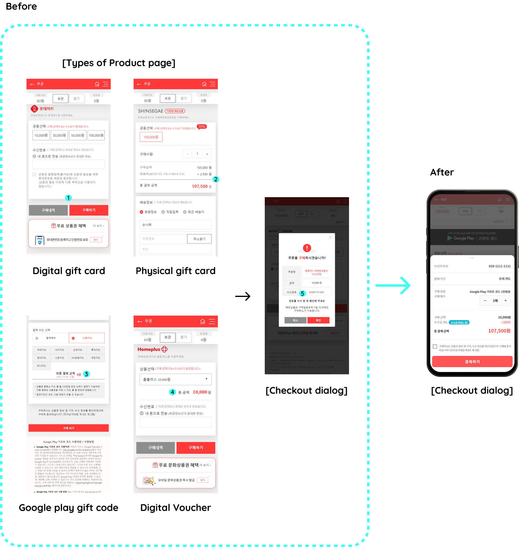
- Digital gift card product page didn’t display the total amount
- Physical gift card product page displayed a sub-total including shipping charges, but fees are not displayed.
- Google play gift code product page displayed the total amount, but fees are not displayed.
- Digital voucher product page displayed the total amount, but on the checkout dialog, the total amount increased because of the additional fees.
Total amount changes on the checkout dialog.
Pain point 03
Dialogs interrupt the seamless checkout experience.
Solution
Reduce unnecessary dialogs.
I reduced 2 out of 3 dialogs for the seamless checkout experience.
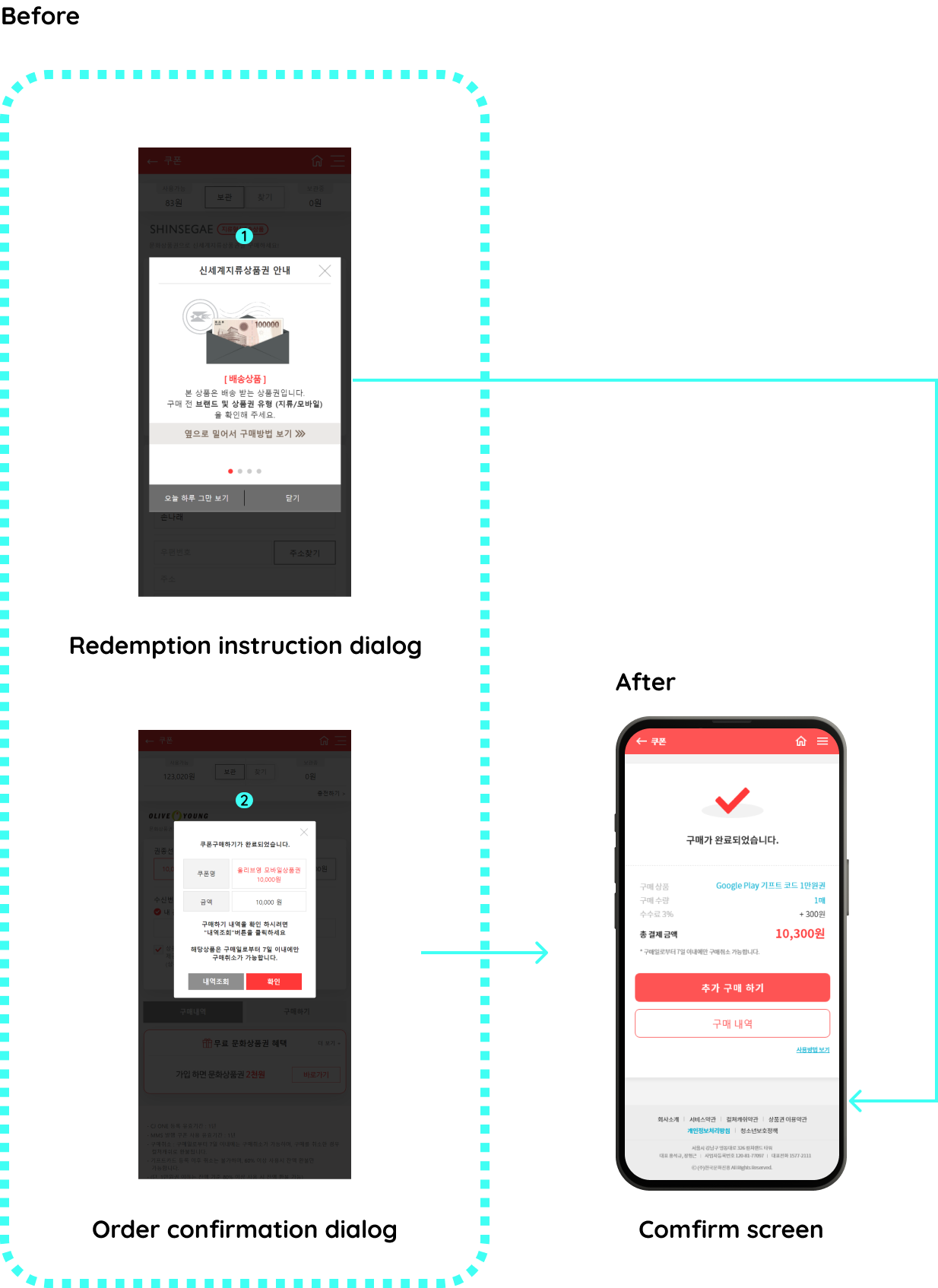
- Redemption instruction dialog that appears as soon as entering the product page: Redemption instruction is needed after purchase, so I moved this into the order confirmation page.
- Order confirmation dialog: I made an order confirmation page instead of using dialog. It will be a trust signal to users that their money has reached the right destination.
Pain point 04
Lack of search feature
There is no search feature, so users have to scroll down and find the product one by one.
Solution
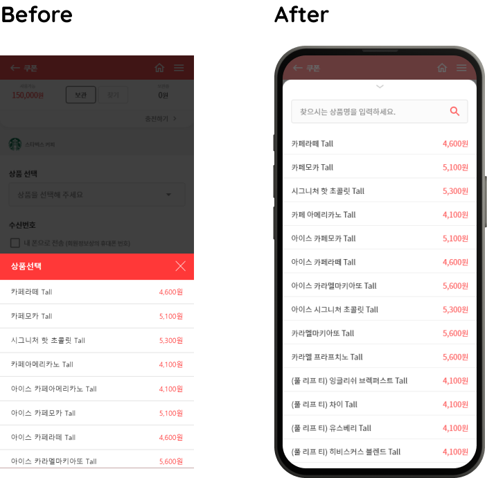
Add a search feature to the product selection box
There are a lot of options to choose from, so I expand the height of the dialog and added a search feature.
05. Final design
I created Culture Land Mobile App Design System and applied it to this project.
Prototype
01. Physical gift card
02. Digital gift card
03. Digital voucher
04. Google play gift code
Design system
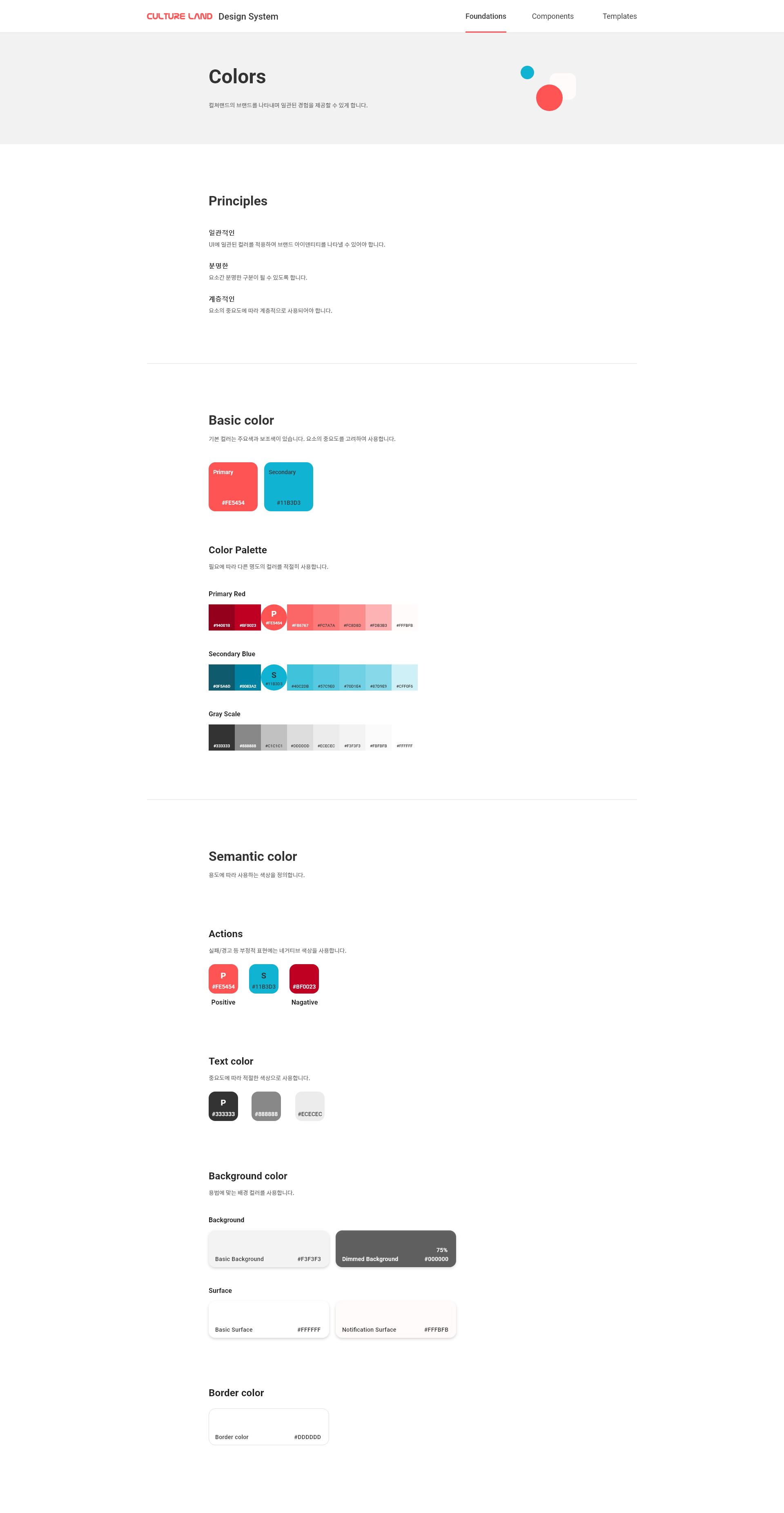
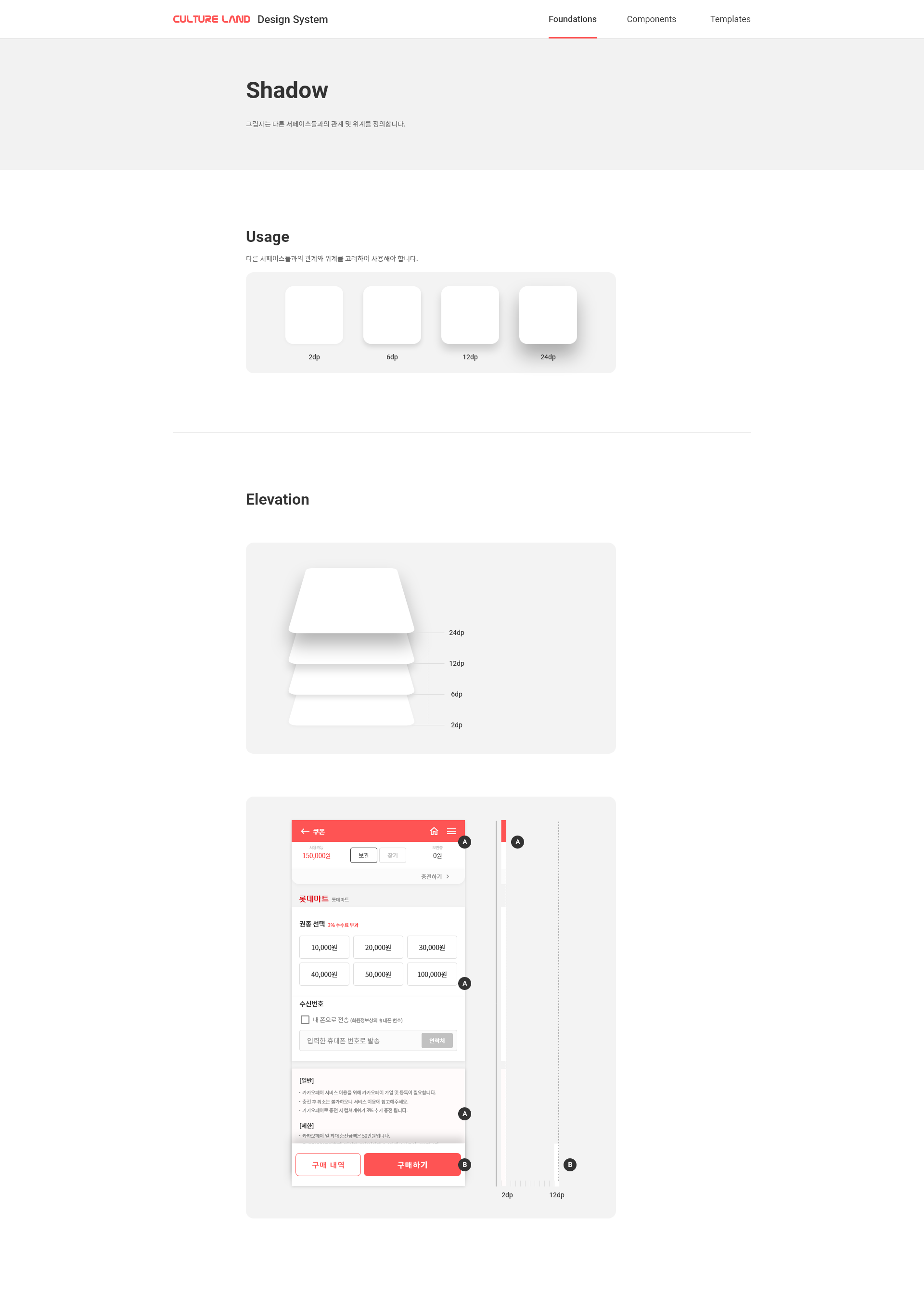
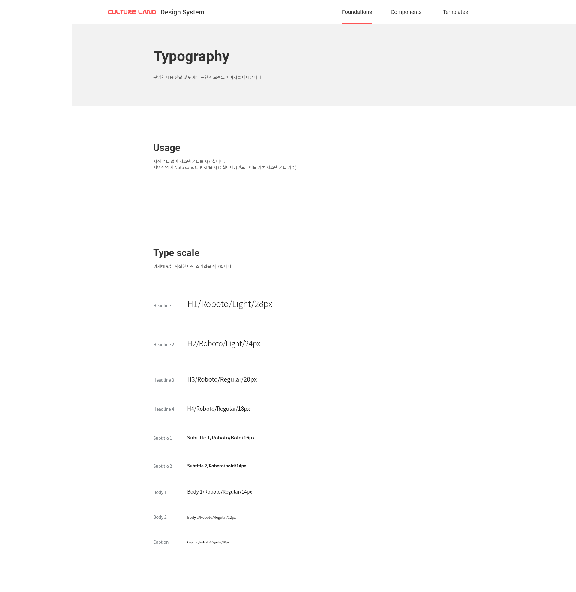
I created a design system for a consistent experience.
Design system

Takeaways
I expected that the design system would offer a consistent user experience and helps boost work efficiency. I made product managers understand how important building a design system is and I got permission for this project. Unfortunately, the design and engineering teams were short-handed to redesign the whole app. But it doesn't mean that I didn't learn anything from this project.
1. Building a design system
I built a design system for the first. I defined the foundation and made reusable components and templates.
2. Importance of communication
I realized once again how important it is to communicate with engineers to understand engineering constraints and make actionable designs.
3. Learning new skills
I studied Figma and the design system for this project. I also tried to do user research and usability study but I had to admit that I need to work on that skills more. It was the opportunity to realize that I need to learn new skills.